The evolution of the territory’s highway border-crossing signs since the 1940s
For as long as there have been highways into the Yukon, there have been roadside signs welcoming visitors to the territory, and welcoming locals back home. The design of these signs has changed many times, over the years, according to needs and trends in tourism.
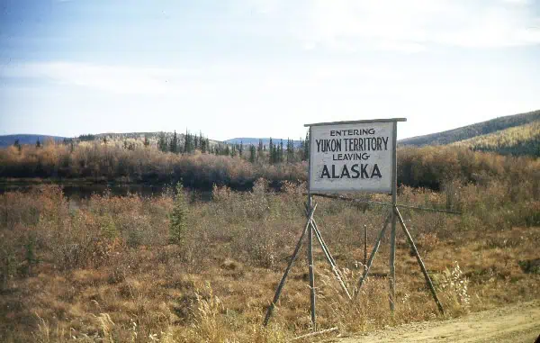
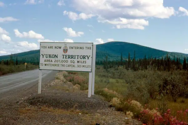
When the U.S. army constructed the Alaska Highway in 1943, the road signs were functional and informational. Up to the 1950s, the main transportation and tourism routes were by train and boat, running through the White Pass & Yukon Route Railway network, so there was not much need for welcome signs on roadways.
In the early 1950s, the North Klondike Highway was completed to Mayo and then Dawson City.
In 1955, the completion of the Top of the World Highway allowed travellers to drive all the way to Alaska.
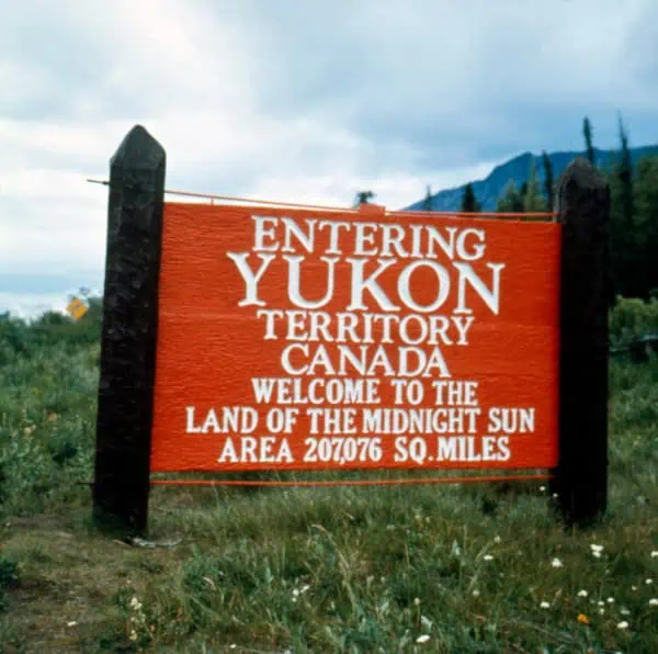
The growth of the Yukon’s road network, including the Stewart-Cassiar, the South Klondike and the Dempster highways, in the 1970s, coupled with marketing efforts promoting the Yukon as a tourist destination, brought more road-trippers to the territory. With more road traffic, the signage evolved to become more creative and welcoming.
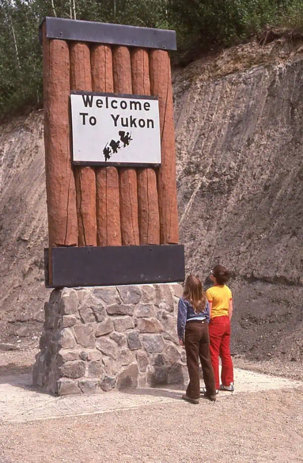
In 1977, as part of a broader Yukon government sign policy, which included a new visitor facility, campground and visitor attraction signs, new border signs were also installed featuring a stone base, wooden planks and a white sign depicting three Chilkoot climbers and the words “Welcome to Yukon.”
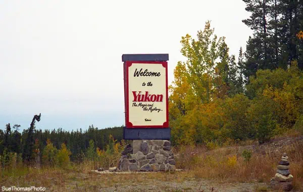
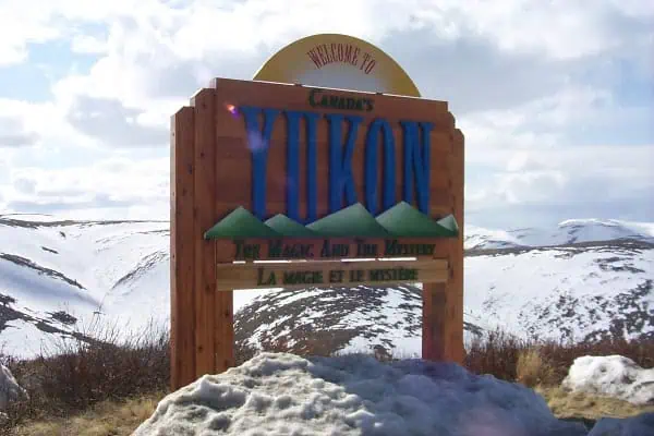
Nearly 10 years later, there were plans to update the signs with a new slogan and design. Visitors to the territory would be welcomed to the Yukon with the tagline “The Magic and the Mystery,” announced the Whitehorse Daily Star on April 24, 1987.
In 1996, wood-based signs were first installed at border crossings and would become the foundation of Yukon welcome signs for nearly 30 years. Those first signs used “The Magic and the Mystery” slogan as well. Eventually, an additional panel was added with the French translation “La magie et le mystère.”
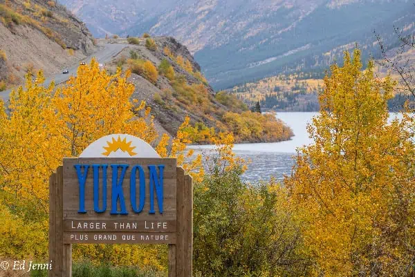
By 2000, the slogan and the welcome signs were changed again to “Canada’s True North / Splendeur du Nord Canadien.” Then, in 2006, the Yukon slogan became “Larger than Life / Plus grand que nature” and the signs were updated again.
Throughout the years, many of the sign changes were met with some public pushback. For example, when the “Larger than Life” tourism branding was unveiled, one opposition MLA compared the slogan to adult entertainment marketing.
After 28 years, the wood-based signs were crumbling and falling down. It was time for a change.
“A lot of the signs had been patched and propped up, so they were at their natural end of life and needed replacing from a safety perspective,” says Rebecca Jansen, manager of the Yukon Historic Sites Unit (HSU).
The HSU manages maintenance on the welcome signs as a part of its larger interpretive signage program. Over the past few years, the HSU has also been involved in the welcome sign replacement project, working closely with the Yukon Tourism Branch through the Yukon Tourism Development Strategy.
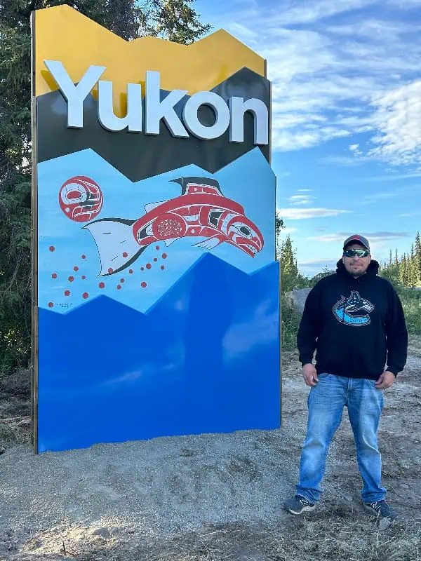
With the goal of reflecting the Yukon’s heritage, culture, landscape and wildlife, the project team put out a call for Yukon artists to submit artwork, and they received many submissions. Four community-based selection committees were created throughout the territory to choose the artwork that would be featured on the signs in their unique regions.
The artists selected for the signs were Terrence Shorty, Maegan Garrett, Chantal Rousseau, Kimberly Edgar, Ferryn Nowatzki, Leslie Leong, Justien Senoa, Tara Easley and Dustin Sheldon. The signs showcase nine exceptional Yukon artists and allow visitors and locals to see different signs on their travels throughout the Yukon.
In a statement about his artwork, Shorty, who is of Northern Tutchone, Tlingit, Norwegian, and French descent, said, “I am honoured and excited to have my art and my message greeting Yukoners and visitors. Salmon are the lifeline of our First Nations culture. They teach us that as we move across the land and the water, we need to look after one another and our sacred animals. The land and the water feed us and give life to our children.”
The artwork in these signs will be changed, periodically, to give more Yukon artists the chance to apply and represent the territory.
This time, the signs simply say “Yukon” without a slogan. Jansen says it was the most-inclusive language to use to represent the territory because it is multilingual.
Hvactech Systems Inc., located in Whitehorse, fabricated and installed the signs in all nine locations. “We were really excited to be involved in this project. The gateway signs become symbols of the Yukon that will be in place for years,” says Molly Keizer, Hvactech System’s sheetmetal manager and welding supervisor.
Keizer’s team received the design and then had to figure out the best way to fabricate the signs, using steel and aluminum, so they would withstand the territory’s sometimes-harsh weather conditions.
Because the signs required many welds and lots of polishing to hide the joins, they also used the project to train youth apprentices (ages 17 to 25) in the shop, on fine detail work. In the end, the signs were so smooth that some people thought they looked like plastic, says Keizer with a laugh.
You can find out more about the signs at Yukon.ca/welcome-signs.